

I think that black and white films have a sparkling quality.
They can also be dark and shadowy or clean and sharp. They can be many things.
Contemporary black and white films, of which there have recently been a few, also have an inescapable nostalgic quality. I watch them and can’t help but think of old Hollywood and the French New Wave.
Black and white film creates a cool palette of stark contrasting tones. But in the space between the white and black there are many shades of grey and to my mind there is warmth and beauty in this monochromatic spectrum. When used well, black and white film adds texture (smooth and shiny, crisp and crinkly, grainy and tactile) and depth, not only to images, but also to the narrative.
Black and white has never really gone away.
Wikipedia tells us that since 1970, when feature films have been made almost exclusively in colour, at least a couple of hundred films have still been shot (principally) in black and white. These have included some of the most important and interesting films of each decade, including: The Last Picture Show (1971, Peter Bogdanovich), Eraserhead (1977, David Lynch), Manhattan (1979, Woody Allen), The Elephant Man (1980, David Lynch), Raging Bull (1980, Martin Scorsese), Mala Noche (1985, Gus Van Sant), Wings of Desire (1987, Wim Wenders), Schindler’s List (1993, Steven Spielberg), Ed Wood (1994, Tim Burton), Clerks (1994, Kevin Smith), Dead Man (1995, Jim Jarmusch), La Haine (1995, Mathieu Kassovitz), Pi (1998, Darren Aronofsky), The Man Who Wasn’t There (2001, Joel and Ethan Coen), Good Night, and Good Luck (2005, George Clooney), The White Ribbon (2009, Michael Haneke) and The Artist (2011, Michel Hazanavicius).
In just the past year alone we’ve had Tabu (dir. Miguel Gomes), Blancanieves (dir. Pablo Berger), A Field in England (dir. Ben Wheatley), Much Ado About Nothing (dir. Joss Whedon), and now Frances Ha (dir. Noah Baumbach).
But what does stripping colour really add? Is black and white now only used as a marker of a film’s artiness or its cheapness? Or is it quite deliberately nostalgic, as I think it is in Tabu and also Much Ado About Nothing, which was better able to connect Shakespeare’s sparring lovers to the gender wars of the screwball comedies of the 1930s through these monotones.
Black and white looks back. But it’s also forward thinking and wildly innovative when used for particular dramatic effects.
This is obviously true of so many of the classic film noir of the 1940s and 1950s. In films such as The Maltese Falcon (1941), Double Indemnity (1944), The Third Man (1949), Sunset Boulevard (1950), In a Lonely Place (1950) and Touch of Evil (1958), characters, story, mood and atmosphere take shape within the play between light and shadow that has its roots in German Expressionism.
Sometimes, black and white is a necessity that comes to bear significant artistic fruit.
Alfred Hitchcock had shot films like Vertigo (1958) saturated in glorious colour but made a deliberate choice to shoot Psycho (1960) in black and white. When Paramount executives rejected his premise for the film and denied him his usual budget, Hitchcock made the decision to shoot in black and white, with his Alfred Hitchcock Presents television crew, to keep costs down and give him freedom from studio intervention. (This was Hitchcock’s last film for Paramount and by the time principal photography had commenced, he had moved his offices to Universal, and the film was shot on the Universal back lot.)

But did he know, when he opted to spend less money, that this was a choice that would invariably shape the film’s visceral impact on the public and on the cultural imagination for many years to come. He must have known that the film’s centrepiece scene, in which Janet Leigh’s Marion Crane is stabbed to death in the shower of the Bates Motel, would be less brutal in monotones.
The impact of the shower scene has always been in what is and isn’t seen. There is blood on Marion’s body and washing down the drain, but sapped of colour it’s just another shade of grey. It’s blood, but it isn’t. The horror is real and also staged.
There seems to be an inversion of this principle at work in a more recent example.

Spielberg’s decision to shoot Schindler’s List in black and white (the first black and white film since the excellent The Apartment in 1960 to win the Best Picture Oscar) helped to give the film its historical context. But the decision also added extraordinary power and emotion to one of its central scenes, in which the camera follows a very young girl in a red coat (one of the rare uses of colour in the film that includes the lighting of the Shabbat candles in its opening scene) through the liquidated Krakow ghetto. The coat becomes a focal point for Schindler’s and our eye; the rest of the scene recedes. His focus and ours is on this innocent girl and what will become of her. And we eventually lose her in the chaos. We find her again, later in the film, when Nazis are ordered to dig up the Jewish bodies they have buried so they can now be incinerated, to destroy evidence of the slaughter in the Krakow ghetto. Among the decomposing bodies we catch a glimpse of a red rag on a small lifeless form. The coat’s vitality is now gone yet Spielberg’s discriminate use of colour has made a strong argument for the power of his stripped back palette. When colour does appear it has the power to shock and distress us, to remind us that in this rather deliberate cinematic construction is very real horror and loss.
Like much of the French New Wave that it borrows freely from Frances Ha celebrates the art of filmmaking and the film’s star, here played endearingly by Greta Gerwig. The mood and style of Truffaut is here in particular – in both the vignette style of storytelling he uses in Jules and Jim (1962) and Georges Delerue’s iconic theme that Baumbach borrows freely from to capitalise on the pathos. Gerwig, so memorable in Baumbach’s previous film, Greenberg (2010), is both graceful and awkward, a thoroughly modern twenty-something heroine but also a clear descendent of Annie Hall. Many critics have rightly compared Frances Ha’s monochromatic street level New York imagery to Woody Allen’s Manhattan, but I think Annie Hall’s nervous protagonist in search of herself is the emotional scaffolding holding Baumbach’s whole film up.
‘I’m not a real person yet,’ Frances says, matter-of-factly, when her credit card is rejected at a restaurant. Baumbach has said in the New York Times that his film is about ‘That period in your 20s where you’re necessarily having to separate yourself from a kind of romantic idea of yourself.’
Frances is on the cusp of adulthood and her friends are moving there faster than she is. To account for the ‘mess’ all around her she repeatedly says she’s busy, but what she does (modern dance apprentice) she doesn’t really do, she can’t account for her bruises, and is ultimately stuck in a moment she’s not sure how to get out of. As someone who also seems to be spending much of her adult life with no idea of what she should be doing or what to do next, for me, Frances is a kindred spirit.
Frances’ struggle for identity is both heartbreaking and optimistic and although the film’s extreme hipness is sometimes overcooked it’s a story told with tremendous heart and joyful charm. It’s a romance between friends – Frances and Sophie (Mickey Sumner), ‘the same people, with different hair’ – with moments of exquisite shapelessness that mirror the rhythms of everyday life. As a woman, I appreciated that we got to see a different kind of female story – that Frances’ personal growth didn’t play second fiddle to Frances’ role as some man’s love interest.

And importantly there are moments that are quite magical and uplifting.
I love the scene in which Frances half runs, half dances with unbridled enthusiasm down a street to Bowie’s splendid song ‘Modern Love’, in direct homage to Denis Lavant doing the same thing to the same song (but with the camera moving in the opposite direction) in New Wave inspired Leos Carax’ Mauvais Sang (Bad Blood, 1986).
Black and white gives Frances Ha a real sense of nostalgia, despite being a film very much about now. It also gives it a very disarming intimacy that drew me right into the chaos of Frances’ life. For the 82 minutes I spent with her I believed that black and white was her palette. She’s in a state of becoming, taking form, like a caterpillar waiting to emerge from her cocoon. Here, the black and white around her is just a transitory state, so much so that when the film ended with a definite shift in Frances’ fortunes I half expected her to explode onto the street, a butterfly, into a colour film.
And so to end I have to pose a question I think I’ve answered: Would film masterpieces like The Seventh Seal or Manhattan or Raging Bull or The Elephant Man be the same if they had been shot in colour? No. Here are images from my five favourite black and white films released since 1970. Iconic images. Images you can’t picture any other way. See if you agree.
Raging Bull (1980, Martin Scorsese)

Nostalgia. Rage. Intensity. Masculinity under a bright light, black, white and bruised all over. The only boxing film that counts (well, maybe also Clint Eastwood’s Million Dollar Baby, oh, and that boxing film Daniel Day-Lewis was in that no one’s seen), Scorsese took the very physical story of a brute, Jake LaMotta, and turned it into a psychic drama of operatic proportions and just happened to make a monochromatic masterpiece in the process.
Manhattan (1979, Woody Allen)

New York will forever live in my mind in black and white. And Woody Allen is to blame. Few things surpass the opening sequence of Manhattan, a montage of city scenes edited to the rising rhythms of Gershwin’s Rhapsody in Blue. Allen’s is a very narrow view of New York City, a romanticized view, an unashamedly nostalgic view, but a view I’ll happily return to again and again.
The Last Picture Show (1971, Peter Bogdanovich)

Film historian and critic turned director, Bogdanovich was 31 when he made The Last Picture Show. Set in 1952, it was a film that stood out like a sore thumb from its ‘New Hollywood’ contemporaries. It has an old-fashioned insularity, in its view of decaying small town American life in Texas, sort of like a precursor to Friday Night Lights. This beautiful beautiful film about teenagers on a road to nowhere (played so memorably by Jeff Bridges, Timothy Bottoms and Cybill Shepherd) evokes a mood of sadness in a summer pulsing with sexual tension – the film’s monotones have a sort of white heat, an effect of lighting real locations like they were film sets. Everything is a little flatter and a little brighter than real life. Hyperreal. Looking back to a lost American moment, there is an exquisite nostalgia in The Last Picture Show; as Ebert said, it tunnels down to the visual level ‘in a way that will affect audiences even if they aren’t aware how’.
Good Night, and Good Luck (2005, George Clooney)
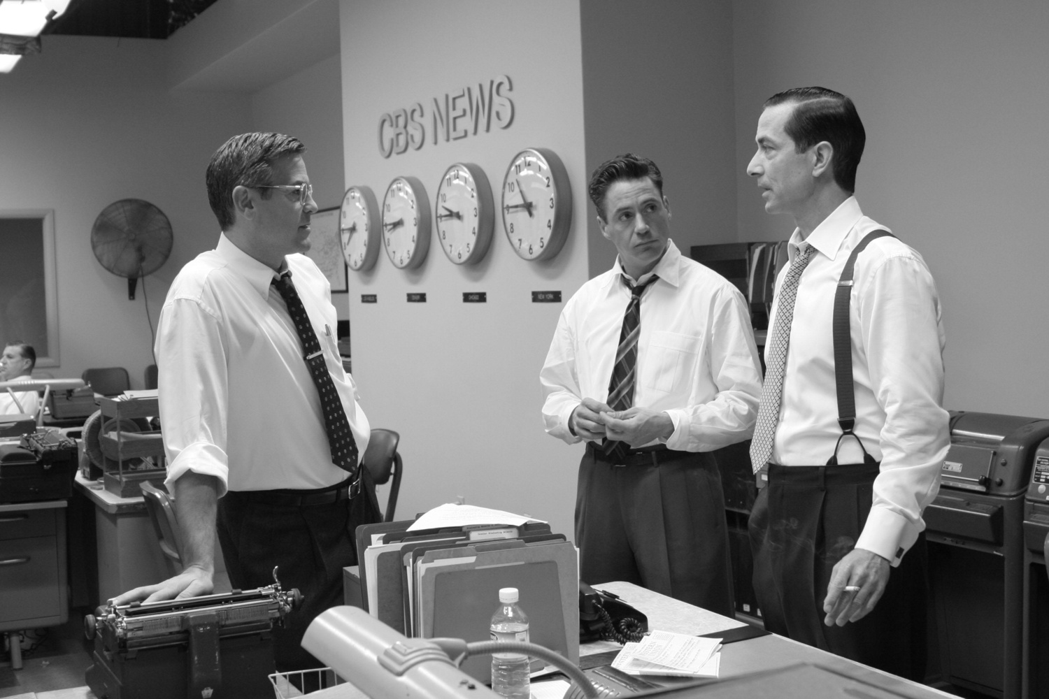
A film for grown-ups, George Clooney’s finest moment so far as director, Good Night, and Good Luck, has a clean, crisp surface immediately identifiable as the 1950s. The film’s gorgeous period detail – and the cigarette permanently aglow between David Strathairn’s elegant fingers – is more intensely rendered in these complex grey tones. Clooney hit the jackpot when he was able to incorporate the gorgeous voice of Dianne Reeves into the film, as the singer in a small jazz combo recording at CBS, because we all know jazz is at its best when it’s black and white.
Control (2007, Anton Corbijn)
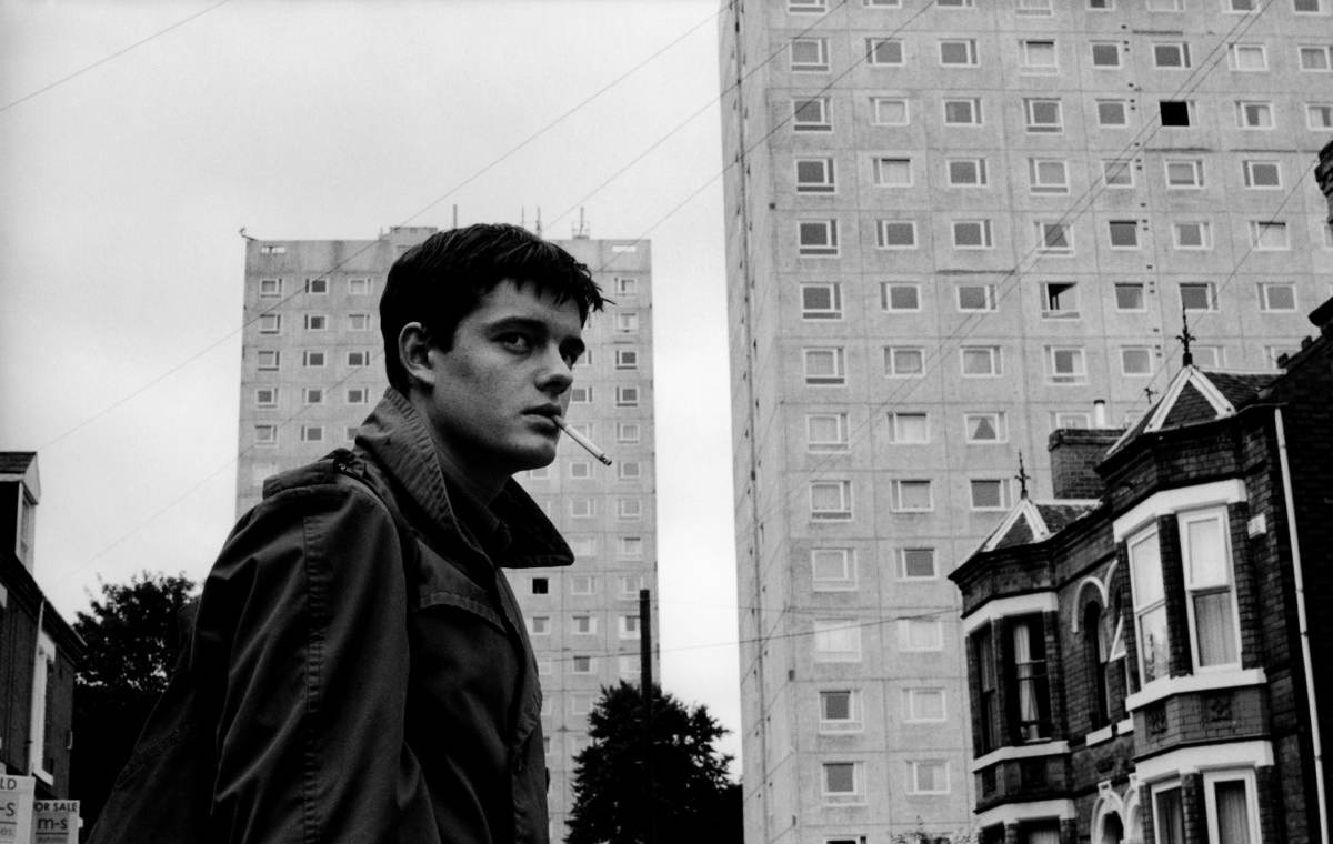
Joy Division made dark, layered, sexy music. Anton Corbijn takes dark, sexy tactile photos. As a music photographer, he helped give visual life to Joy Division when he was starting out (he’s also famously photographed Depeche Mode, REM, David Bowie and U2), so it made sense that his exceptional debut as a film director would be about a band whose aural landscape perfectly fits his visual style. At times devastatingly sparse and cold, Control is about the alchemy of creation in a gloomy landscape, which Corbijn imagines in starkly contrasting tones. There’s an electric tension in almost every scene, the musical performances, especially the band’s early, unsteady ones, black and explosive. Corbijn puts us right in the middle of it – contrasting the light and darkness outside and inside Ian Curtis, contrasting the drab ordinariness of Salford with the extraordinariness of that first gig as Joy Division at Pip’s Disco in Manchester in 1978.

Loved Frances Ha and blogged about it a while back. I usually heartily dislike Noah Baumbach’s work, but Frances (while occasionally irritating) is so good-hearted. It also so sweetly distils what your 20s really feel like.
And black and white is so gorgeous…It has a totally different quality. My husband is a photo editor and we’ll often choose to print our images in b a w or sepia. Once the color is removed, you lose that distraction.
Thanks. My problem is my 30s are still feeling a bit like my 20s. Good point about losing the distraction once you remove the colour from a image.
I wasted my 30s in a terrible marriage, trying to “make it work.” Now in my mid-50s (shriek) and hustling 10x harder for work than I ever had to in my 20s. I think life looks very different for many of us than it once used to, or we expected it to.